The Data: The energy data, hosted on Kaggle, is from a regional transmission organization called PJM Interconnection LLC. Within PJM’s data, I selected the subset from Dayton Power and Light (DPL). The weather data is from NOAA. Here is a link to my Github page hosting the Google Colaboratory notebooks where I cleaned and visualized the data.
Background
I started this project with the intention of digging into the relationship between energy demand and air temperature, with the goal of better understanding how complex energy systems operate. To best explore this, I wanted energy and temperature data on the highest possible time resolution. Equally high time resolution between datasets would allow me to do less data cleaning and also provides more detail. In order to focus on a single weather station, I also wanted to look at the smallest region that I could find. This led me to the hourly energy data in megawatts (MW) from DPL, which serves 525,000 customers across 6,000 square miles. To approximate the weather of this entire region I used hourly data gathered at Dayton International Airport.
Mean Hourly Demand vs Mean Hourly Temperature
To start off, it is helpful to take a look at how both daily energy demand and daily air temperature vary during an average day in each season:
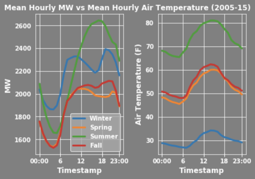
Something that immediately jumps out is the similar general shape among the lines. Energy demand and temperatures are lowest in the extremely early morning when most people are asleep. Then, they both increase gradually throughout the day and taper off at around 3:00 PM. This shape is well known and has a vital relationship with our energy generation systems. More on that connection can be found from the Department of Energy here.
Also take note of the differences across seasons. In particular, summer and winter are the seasons with the highest relative energy demand. This makes sense when considering that higher or lower temperatures would lead to spikes in cooling and heating demands, processes that can require a great deal of electricity. It’s also interesting that an average summer day has the highest peak electrical demand of all the seasons, a point that will be touched on more later.
Mean Daily Energy Consumption Over the Course of a Year
Next, let’s take a look at the mean total MW consumed every day in a year:
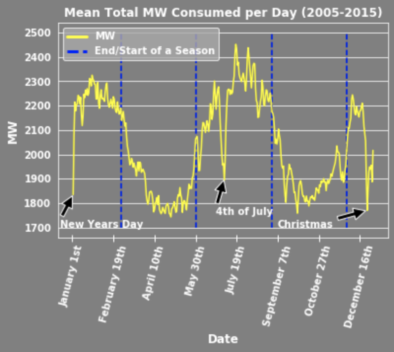
The differences between seasons can be seen once again, shown this time using dotted blue lines. It is very apparent that energy demand changes across seasons. Perhaps even more interesting are the extremely low demands during New Years Day, 4th of July, and Christmas. Such a sharp decrease during national holidays makes sense when considered in the context that many businesses that require large amounts of electricity may be closed. These dips in demand are also highly important to energy generators that need to adjust output to meet changing demand. To see some more info on how common behavior changes across populations have an immediate impact on energy demand check out this twitter thread that partially motivated this blog post.
Mean Daily Temperature & Degrees Cooling/Heating
Lastly, let’s take a look at the mean daily temperature per day in a year:
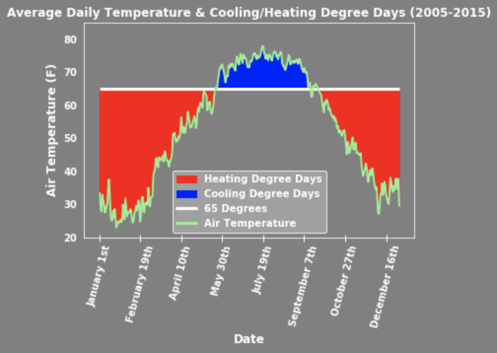
There are two more metrics shown on this figure called cooling degree days (CDD) and heating degree days (HDD). CDD and HDD measure how much warmer or colder the temperature is compared to a standard temperature, usually 65 degrees Fahrenheit. The general idea is that at 65 degrees most people do not heat or cool their homes and as the temperature drifts further from that standard, people will use more of these services and therefore more electricity. For example, if the mean temperature of a day is 75 degrees Fahrenheit then that day has 10 CDD. To learn more about degree days check out this page by the U.S. Energy Information Administration.
A key takeaway from this figure is the difference in the amount of CDD and HDD. It is clear the there are more HDD than CDD even though earlier we noticed that summer days, when CDD occur, have the highest mean energy demand. We can explore this relationship further through a correlation matrix:
Correlation Between Energy Demand and Temperature Metrics
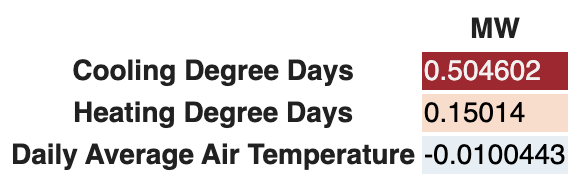
The explanatory and predictive usefulness of heating and cooling degree days really becomes clear when looking at the correlation between energy and temperature. As previously pointed out, summer days have the highest energy demand despite CDD in the summer being lower than HDD in the winter. This is due to the level of demand driven by CDD compared to HDD. CDD has a 0.504602 correlation with MW, compared to HDD at 0.15014, and daily average temperature at almost 0. This is most likely due to the fact that many cooling systems demand electricity whereas most heating systems use natural gas or oil. It is also likely that the increase in electricity use from relatively high or low temperatures muddies the correlation between average temperature and MW.